

Before we make this about UX case studies, let me tell you something about cooking. Recipes, to be more specific.
If you want to cook anything, let’s say chocolate chip cookies, there are two types of written-form recipes you will run into.
1. The blog recipe
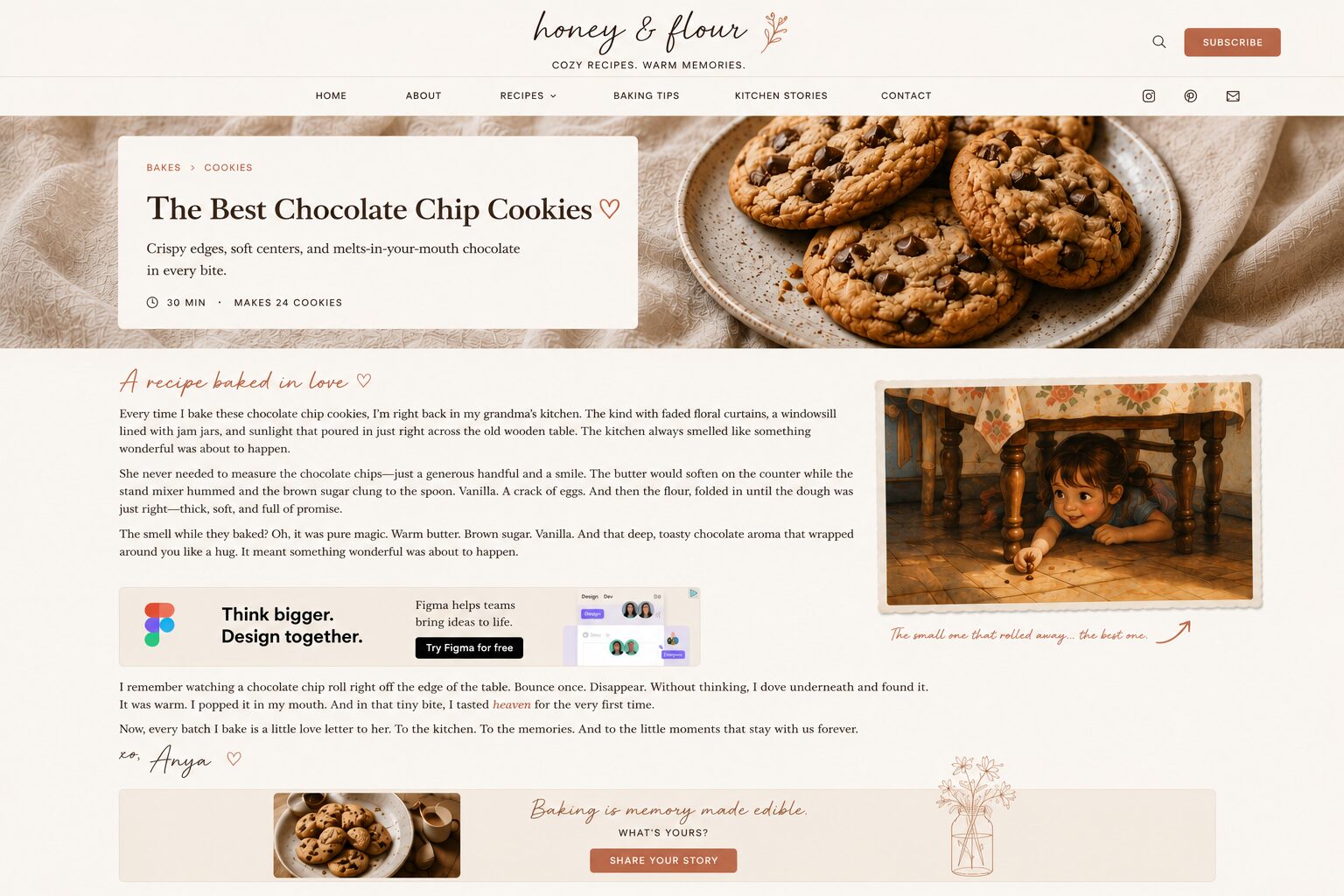
These recipes start with a story. Usually a loooooong one. Usually about how the author’s grandmother cooked something. How the smell in the childhood kitchen was. You will get to imagine a small choc chip accidentally rolling off the table, a child catching it from underneath, tasting heaven for the first time. Or something else along those lines.
A banner goes here.
Then the story follows with how the second generation modified the recipe. And how cottage cheese is added now, in the latest protein-packed version by the author.
Another banner will be shown in between here.
Then comes a story for each of the ingredients and an ingredient list. How organic cottage cheese is much better than regular.
Guess what comes next — a banner.
Then preparation. With the melt, wait, freeze overnight, un-melt the butter technique.
Then summary. Again with some stories, this time about how much the kids like this version better and don’t go into temper tantrums.
60000 pixels later, you get what you came here for.
You don’t have an overview. It’s all a blur. It feels like a night of partying (too)hard.
Apologies to all food bloggers out there, I need to get a point across. As you can see, I am also a long form writer and love to expand on topics.
I get why this is so. I love stories. But not when I’m in my kitchen with my sugar dangerously low, cooking after putting my kids down for a nap. And not while my hands are dirty and my phone is locking after a minute or so of me being busy with the butter. I love my stories usually for bedtime. Or while I’m in focus mode on my screen away from the kitchen.
I also get the fact that the author has to pay for their bills and the ads support their livelihood. That’s why I still visit these blogs, and despite me bitching and being salty about them, I deeply, deeply appreciate the author’s effort. I know that this is coming from how the world works (and monetisation on the internet works). And how a big part of the problem is the medium itself - the internet and the mobile device with its limited real estate.
To their credit, cooking blogs introduced skip-to-recipe links / anchors. A great UX patch to the problem I highlighted above. Not solving my need for a quick overview and simplicity, but helping me to an extent. Meeting me (or taking me) halfway to the 30000 pixels mark.
Sounds quite familiar right… a bit like a like a typical UX case study isn’t it? Without the banners but almost exactly the same type of experience.The process, the diagrams, the post it notes, the personas, the affinity diagrams, the jobs to be done, the sketches, the wireframes, the double diamond…the whole process shebang…with the design output (1 mockup) all the way at the end.
Before digressing too much… There is another common way to present a recipe.
2. The cookbook recipe
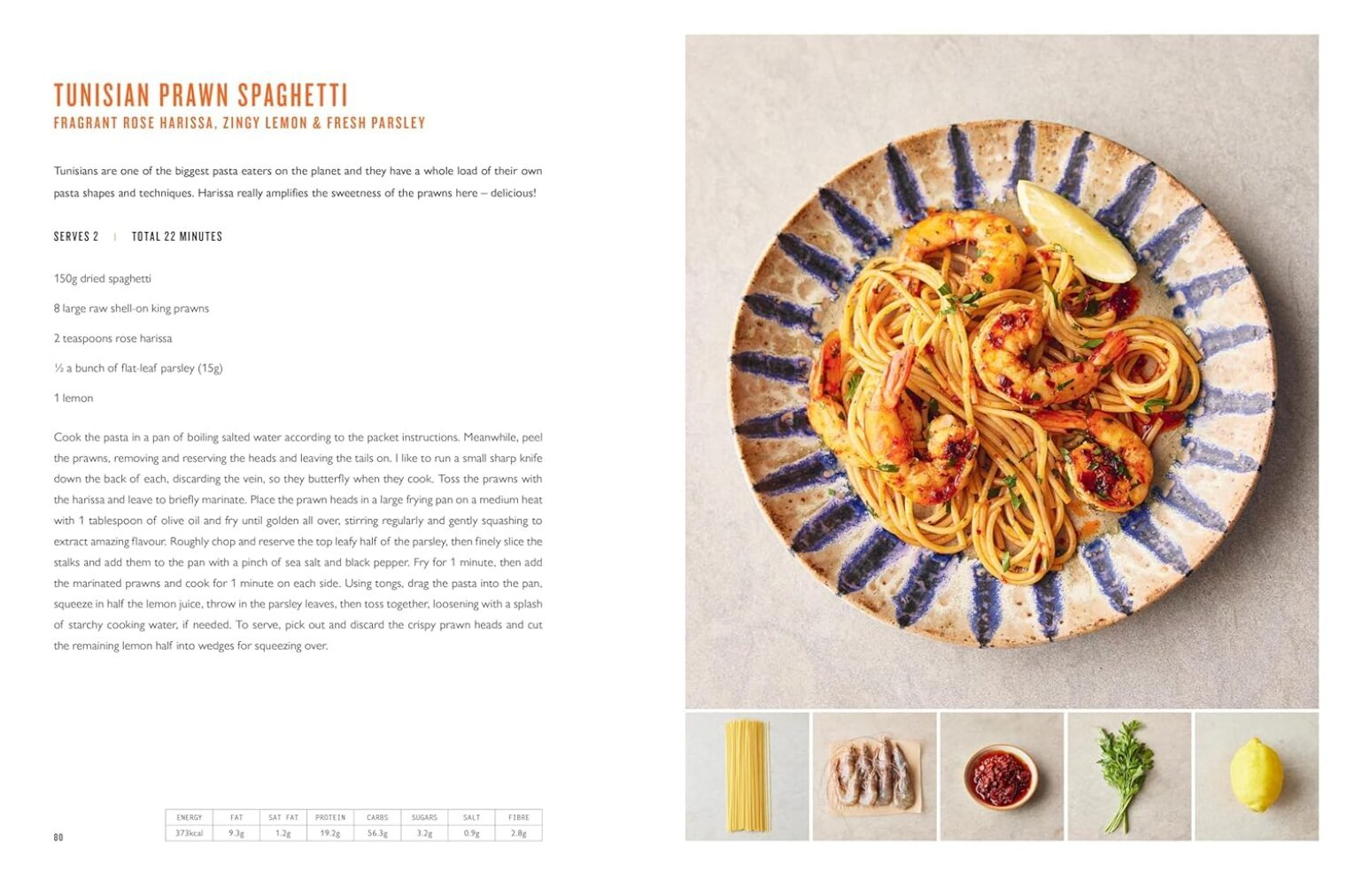
If you open a cookbook, any cookbook, it will look like this:
A page or a full spread photo of the cookies. If you are lucky, it will be a photo by David Loftus of a recipe book by Jamie Oliver. Even luckier, if it’s one of his 5 Ingredients books.
The photo is placed before or alongside a single page summarising all ingredients, prep instructions, macros, and other details. That’s all.
One big beautiful picture that will make you crave the cookies. One simple page summarising everything in one overview. You scan and see everything you need at any particular point in your cooking journey.
This is simple, but as with anything… getting to produce something simple is complicated. It’s an entirely different level and craft. In the words of the legend himself:
“It’s taken me 20 years to write the simplest book I’ve ever written,” — Jamie Oliver
And if you are not convinced that this relates to design, here’s another proof for ya’:
The layout of the book is as stripped back as the cooking — and that’s no accident. “As a dyslexic kid, it’s about clarity but it’s also psychological. Having white space is like saying, ‘you’re alright, you’re cool, you can do this.’ Embrace the white space, the simplicity, show them what ingredients they need.” The TV sets too are cleaner, “more Scandi,” he says.
And as you can probably tell, I clearly have a favourite.
The right way, in my book, is this. I call it the right-a-way type of recipe. Giving me everything neatly summarised on one page, accompanied by one big beautiful photo. No need to skip to the recipe. There is nothing to skip.
How does this relate to UX case studies and portfolios?
UX case studies are slightly more complicated than recipes. But I think UX designers fall into the same traps as food bloggers.
Part of it is because we follow the wrong examples. We see many others doing it this way. Hell, we were even taught UX in this way! So we try to replicate our peers and even our textbooks and courses. We want to be thorough and academic! And we want to show our process and thinking, not just our output. But this is not considering our goals and audience too much (more on this later).
Another cause might be the medium. The web is inviting long-form and article-type content. There is no limit on what a webpage can hold (apart from the fold). And we worked on this for months; we want to show the entire size of our effort, not just the tip of the iceberg. Decks are slightly different and constrain us a bit more, but not fully. I’ve seen examples of endless decks as well.
A word of caution: we might err on the other side if we follow Jamie Oliver’s example. Too simple can also mean that a lot of things are left unsaid and that we don’t utilise the medium too well. If we only use what’s seen in the fold and only keep it static, we miss out on an opportunity to stand out. We might give the feeling of — oh, is this all there is?
Like a good food blogger, I gave you a long story first. Now comes the recipe…
My recipe
If there was a skip to section / recipe anchor type of option on Medium, it would’ve brought you here.
Keep in mind that this is my recipe for a case study. NOT the recipe. It’s my personal feeling and taste, and even though it’s based on some research, experience reviewing portfolios, and advice I give when mentoring, it’s not a universal truth. As with a lot of things in life, there is no singular way of doing things.
This is the 5-ingredient list and preparation specifics:
Design
Start with a big photo, collage, or a gallery featuring your design work / output. This is the most essential thing; this would be the chocolate in the choc chip cookies. Give them irrefutable proof that you can produce (or that your work contributed to) good design. Even if you were a service designer, your work ideally will have a design output. The visual design of that output was not done by you, but you contributed to it, right? And you will give credit where credit is due. If you are a “builder” / UX engineer, I still suggest photos for a simple reason — time. Clicking through a prototype or app can take longer than scanning mockups. Sure, the links to your app or prototype can be there, but I wouldn’t show them as the main and only thing. Remember: “the proof is in the pudding” and “people scan”.
TLDR
Who was the client, what was the challenge, what was the impact before > after. Remember: “elevator pitch”.
The remarkable
This will depend from project to project. It can be a key insight; it can be the concept idea that carries the entire approach. What was the core to your approach? What is the big idea you brought forward? Remember: “the light that starts the fire”.
Process
I suggest a (small) process section / list, NOT a full-blown process story. The story can live elsewhere — behind a click to expand or a click to a new page. I love crafting stories, and I can talk about my work for hours. I can give a keynote about it. But the story is an attachment in your portfolio. It’s not the portfolio. The story can live here, on Medium. I wrote about how we designed a smart banking assistant at ING, and another one about our revamped review process at Booking.com, articles that I link to from my case study summary on the projects in my portfolio. Remember: “ain’t nobody has time for that”.
Your contribution
What was your team composition? What was your role on the team? What did you do besides the classic UX deliverables? Examples: defined a direction, led the team, produced the design hands-on, presented to leadership and got buy-in. Remember: “it was a team effort and / or i was responsible for this”.
Examples
My case studies and portfolio are work in progress. I am still cooking. But I will show some outdated pages from my PDF’s to illustrate and give you some examples of what I talk about.
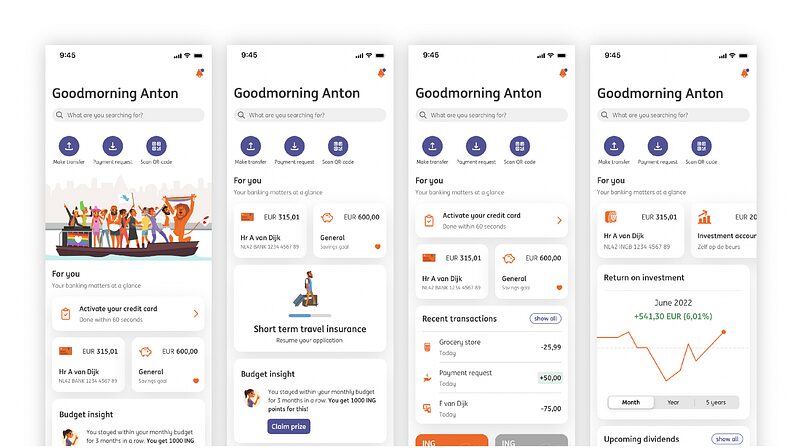
A few freelance projects, with their design output and TLDR:
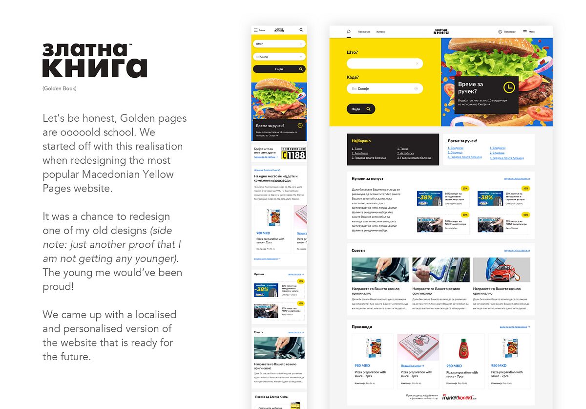
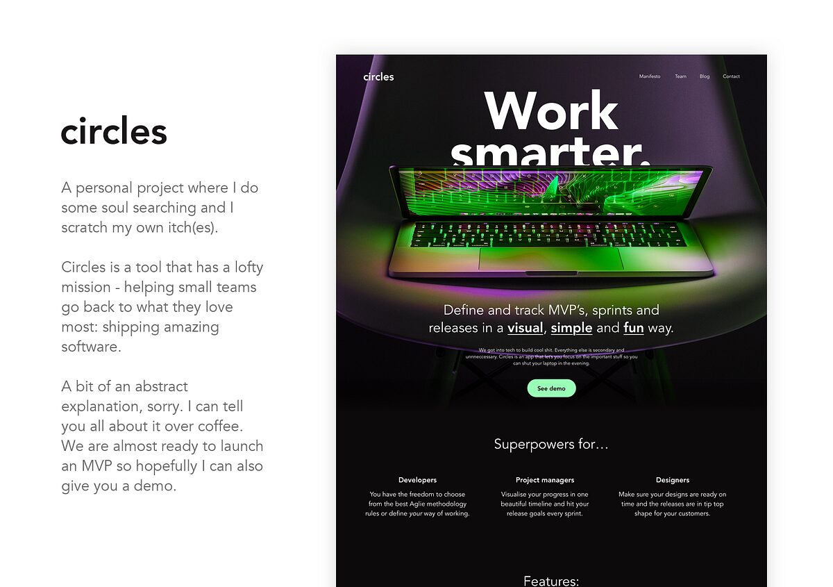
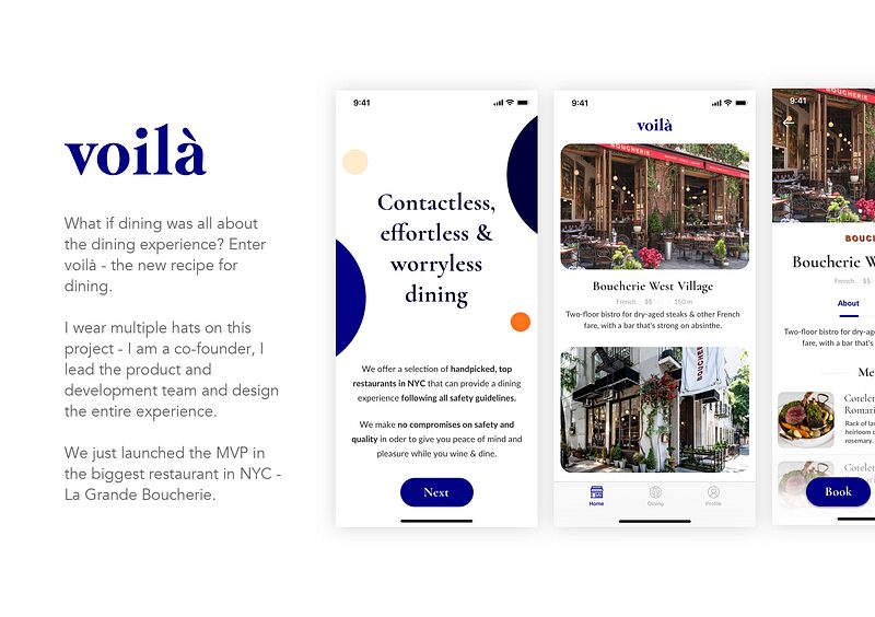
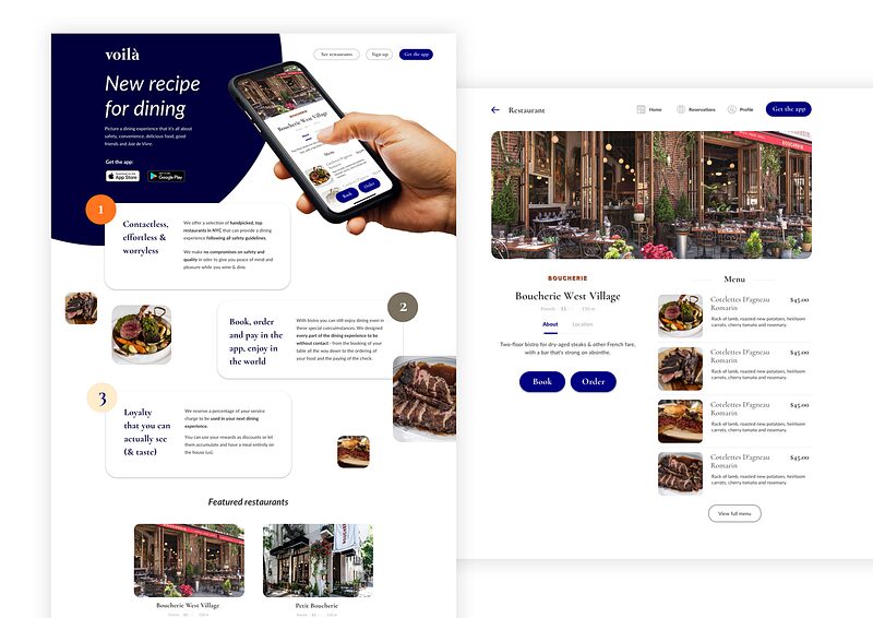
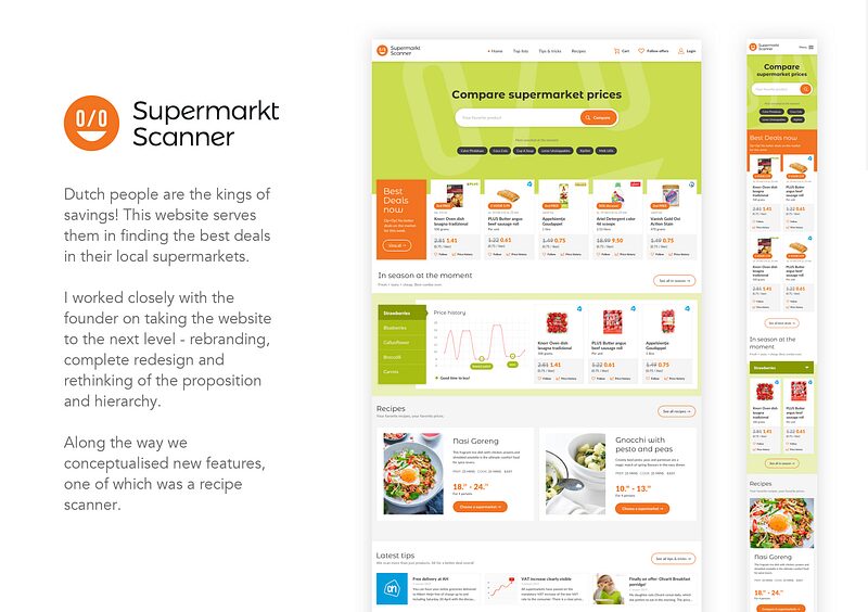
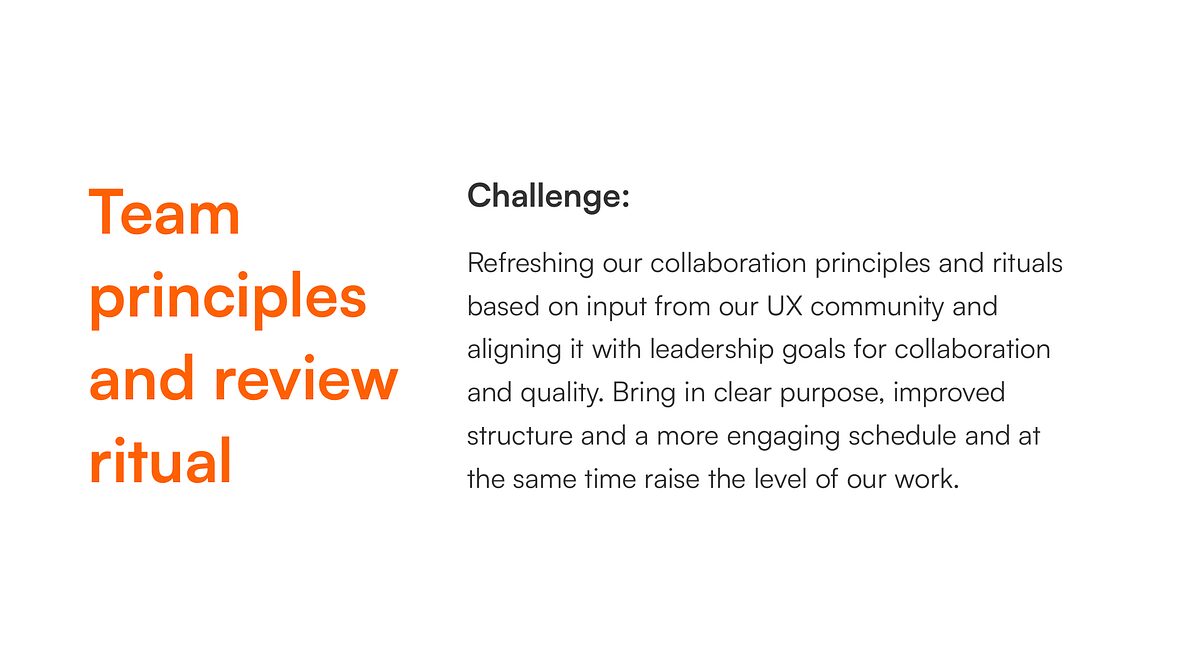
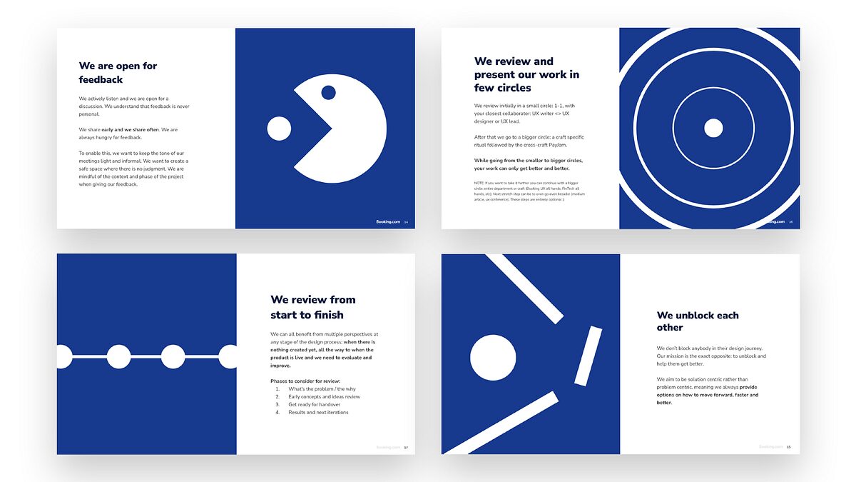
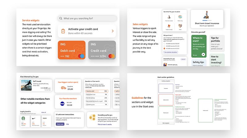
2. A design ritual case study example, illustrating that this does not apply only to design output but also to process improvements:
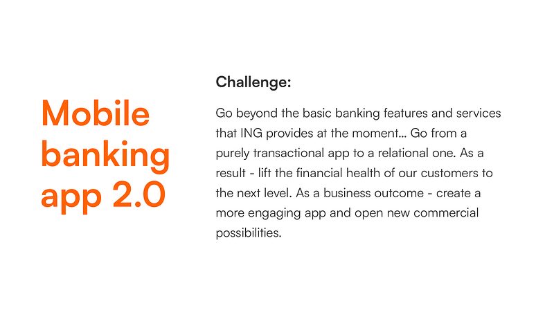
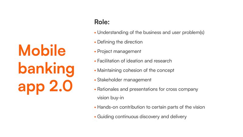
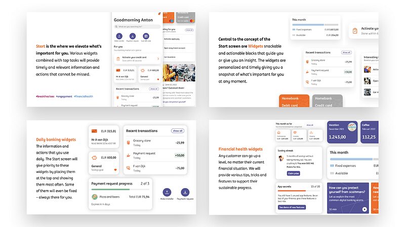
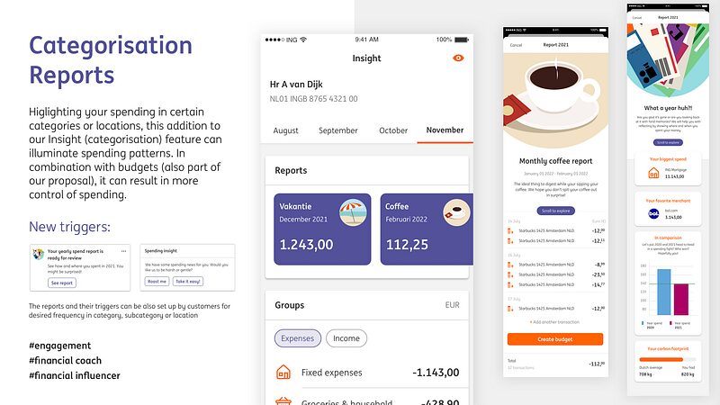
3. More elaborate case study following the same approach, you can see more design artefacts + role and responsibility:
4. The same principles but a different way of presenting the design artefacts:
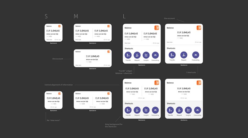
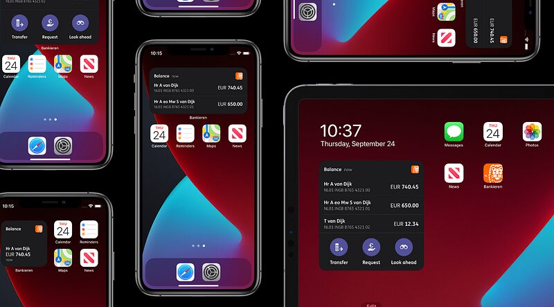
As you notice, there is not much on process above.
I talk about it while presenting, if asked, and if I decide to write a long form Medium piece about it.
Enough about me…
How will YOU apply the recipe?
Get creative.
Have AI summarise your case studies and notes by using my recipe above. Have it produce an S, M, L version of your case study for various uses — PDF, portfolio site, Medium piece.
Then add a (fake / simulated) AI agent on top of your current case study showing a short summary of your current case study. Can be a nice interactive touch in addition to your existing content if not totally replacing it. Or go with a traditional approach — tabs, expansion panels, dialogue windows, deeper levels. Any ways of using progressive disclosure.
For the presentation layer, as one option, following the cookbook approach, this perhaps can be 50% of the width of your slide or webpage view on desktop. Alternatively — Bento grid.
Or don’t take it so literally and go against my advice! Expand to 2–3–4… pages but make it so good that it’s still following the principles from here.
I was thinking of giving you some templates, but that’s where this whole issue started from. Following others. Not standing out.
Follow the rules but learn how to break them. That’s how good dishes become Michelin Star menu items.
Whatever dude, YOU decide.
One key ingredient to all of this is: YOU. What makes YOU special and makes YOUR work stand out?
Part of individuality is also attitude and character. And I think some of the best designers (and chefs) have a show-and-prove mindset. They are working in design for money, personal satisfaction, and bragging rights. For pride. Let me do it in the best possible way to compete and stand out there with the best in the game. To prove myself. And give irrefutable proof to the universe. Keep in mind that your case studies (and portfolio) are competing with others. So give them a chance to stand out.
How is it coming across?
Hate to break it down to you but this is not only about YOU. You are creating for yourself but you are also speaking to an audience. Especially if you have a goal in mind — get hired, get promoted, get clout.
So, think long and hard about the expectations of your reader. Who are you doing this for? Design Twitter, a freelance client, a promotional panner at your company, or a specific hiring manager at company X?
Part of the problem with long case studies heavily focused on process is that they don’t understand the context and the goals of the reader. Similar to a cooking blog, they go in length on the non-essential stuff.
The hiring managers will have limited time and will be scanning and looking for signals — of craft, of taste, of experience, of the clarity of your expression in short words. After passing the first scan, they might read. Or they might even put you in the second round right away. So make a strong first impression. I believe my recipe can help with that. But no guarantees.
Sometimes you have to do something extraordinary…
Next level
You stayed here for THAT long, I have to give you some special advantages and power ups.
I believe that next level work = next level case study.
Often, the presentation layer is not the main problem. It’s the quality of the output. Sometimes the work just simply… speaks for itself. It’s not only about how you present things. It’s also the work itself — the client, the industry and what you put in your designs. So be bold, take risks, and stand out as much as you can with your work.
I know that this is not always possible, and that some of us work for B2B SaaS clients. Not necessarily the definition of sexy work. The output can be still next level, and can appeal, especially if you are applying for something in the same industry. You might not be able to compete with agency portfolios applying for a agency job. But that’s ok. That’s a different game to what you are playing.
Next level portfolio might open the door faster.
Believe it not, I think that your portfolio might get you an interview, even without a case study. It might speak faster about who you are and what can you do (and build!).
So think about — where does this case study live? How does it fit in your portfolio? A lot of decisions will be made by the optics of your portfolio. In the world of recipes — the cookbook itself: its cover, its design and structure, the artist bio.
So think about being expressive, and showing your building capacity. That can be essential, even more so in this day and age of AI.
Disrupt before being disrupted.
While you are busy re-writing and re-desiging your case study, someone might disrupt you. In the world of recipes, that came with video, specifically short form video. Recipes go viral now on Instagram and TikTok (I’m here to let you know whether this f*cks ooooor sucks… those that know know).
Don’t get me wrong, one thing that will always be valid are your design artefacts and story. So, do work on those. But also think of the format and try to go next level with the medium as well. This can mean creating videos but it can also mean making your case studies interactive (and creative).
Get cooking
I hope you enjoyed my cooking show.
Now… roll up the sleeves and get cooking!
You will inevitably mess up many times. It’s part of the process.
But soon enough, after some long and hard work, it will be 🧑🍳 😘
Links & resources for further reading
Case studies are DEAD.” Hiring managers don’t have time to read 5,000-word essays. Femke van Schoonhoven proposes “Showcases” instead of long narratives.
Portfolio Crisis of 2025 — “Long case studies, linear storytelling… don’t hold attention anymore.”
Heshan.Design — “Huge paragraphs nobody reads.” Criticizes oversized portfolio pages.
UX Portfolio Do’s & Don’ts by Chris Nguyen
Most portfolios fail in the first 10 seconds.
Max Richardson — most case studies fail because the story is unclear, not because the work is weak.
Why Does Writing UX Case Studies Feel Harder Than Doing UX Work?
2026’s Biggest UI/UX Wake-Up Call: Case Studies Don’t Convert Anymore — But This Does.”
This article was originally published on Medium. You can find the original post here.